Creating a Floating Label Input form using TailwindCSS (No Javascript)

Freelance Web & UX Designer from Incredible India. I design and develop creative websites, landing pages and applications for startups and e
Here's how you can create a floating label input form using TailwindCSS. We will be doing it with TailwindCSS & some good ol' custom CSS. No need to use javascript for this technique.
The HTML
First create an input with a wrapping div with class name floating-input. Make sure the input have a placeholder attribute because we will be using :placeholder-shown for the floating logic. Then add your label below the input tag. Label should come last because so that we can use the ~ selector to select the sibling using CSS.
Now add the classes for transform, easing & duration to the label. Your final code will look something like the following.
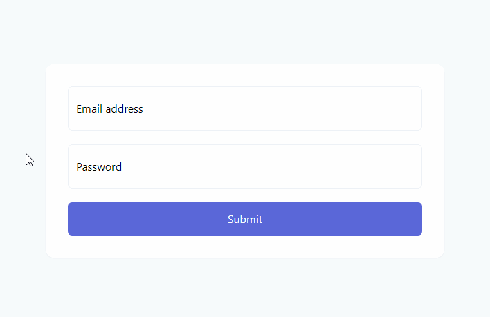
<form class="w-full">
    <div class="floating-input mb-5 relative">
        <input type="email" id="email" class="border border-gray-200 focus:outline-none rounded-md focus:border-gray-500 focus:shadow-sm w-full p-3 h-16" placeholder="name@example.com" autocomplete="off" />
        <label for="email" class="absolute top-0 left-0 px-3 py-5 h-full pointer-events-none transform origin-left transition-all duration-100 ease-in-out ">Email address</label>
    </div>
    <div class="floating-input mb-5 relative">
        <input type="password" id="password" class="border border-gray-200 focus:outline-none rounded-md focus:border-gray-500 focus:shadow-sm w-full p-3 h-16" placeholder="password" autocomplete="off" />
        <label for="password" class="absolute top-0 left-0 px-3 py-5 h-full pointer-events-none transform origin-left transition-all duration-100 ease-in-out ">Password</label>
    </div>
    <button class="w-full bg-indigo-600 text-white p-3 rounded-md">Submit</button>
</form>
The CSS
First set the color of the placeholder to transparent, so that we can still use the property for our logic. The next step is to make transition to the label when the input is focused. We will also make sure no text is typed by the user using placeholder-shown. Then we can also adjust the padding of input to type in the right location. The final custom CSS will look something like this:
.floating-input>input::placeholder {
    color: transparent;
}

.floating-input>input:focus,
.floating-input>input:not(:placeholder-shown) {
@apply pt-8
}

.floating-input>input:focus~label,
.floating-input>input:not(:placeholder-shown)~label {
  @apply opacity-75 scale-75 -translate-y-3 translate-x-1;
}
That's it, our CSS only Floating label is done.
Live Demo: https://play.tailwindcss.com/2Purx7OjqJ
Wrap up
Do you have any other cool ideas to make this work? or did I miss something? Let me know in the comments.


